Taking Mentorship Advice: my revamped business cards
 Thursday, March 10, 2011 at 1:19PM
 One of the pieces of advice I received at my mentorship sessions last year was that I needed to revamp my business cards. As in I really REALLY needed to revamp my business cards.
Here are my old cards:
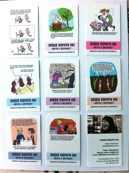
I used MOO to do these cards, which I admit to putting together at the last minute. For the front of each card, I had one of my Inkygirl.com comics for writers. On the back, I had the image you see in the bottom right, with my name, contact info, websites, etc.
While writers tended to like the cards because of the cartoons, they (the cards, not the writers) are graphically WAY too busy.
In fact, Cecilia Yung (Art Director of Penguin) said that when she looked at my card near the end of the judging process, she had to go back to look at my portfolio to remind herself about WHY she had picked me for the Mentorship Program.
Eek.
Anyway, my graphic designer friend Ray Vankleef from One Trick Pony helped me revamp my card design (thanks, Ray!). And I admit that I did find it a challenge to include so much WHITE SPACE. The writer part of my brain kept screaming, "What a waste! You could be including more information!" But I resisted.
Here's the revamped card:
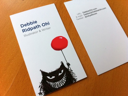
Thank you, Ray!
When I went to meet with Cecilia at Penguin last month, she told me she was so proud of me. :-D
What about the rest of you? Did you design your own cards or get help? Feel free to post samples of your own cards.



Reader Comments (9)
I love them Debbie! I think white space makes such a classy statement! Ahhhh.
Your new cards are great, Debbie - thank you for the inspiration!
The new cards look awesome Debbie! Way to go, getting a designer's help - they look so professional, yet still full of your character. This white space says way more than any extra words could. Another great reason to have plenty of white space on a business card is that folks often like to make notes about where they met you on the card, as a way of remembering how they picked it up. Great work!
These cards are so pleasing in not only a graphic way but in many other ways as well- they're appealing for their contrast and color, the humor, the implied story of the little monster with his balloon- the implied story makes you want to contact you just to find out more of the story, actually. That's just got to be a good thing!
These cards are perfect! I struggle to include white space also. But the result has so much impact & is so memorable!
The new cards look fabulous! And not just because they contain two of my favorite design elements: white space and the color red. The character that bleeds off the card is strong and full of personality. Great job.
Great looking card, Debbie :)
Thanks Debbie! I was trying to look for ideas on what to include on a writer's business card and I think you've really put me on the right track.
-Longines PrimaLuna swiss watchesThanks Debbie!