I'M BORED sketches, first passes, pacing & advice for aspiring picture book writers
 Monday, June 18, 2012 at 1:48PM
 A continuation of my series of posts about how I'M BORED was created. To catch up, see the post archive. Or you can go back to the Main I'M BORED Homepage.
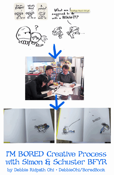
After Justin Chanda and I had some back-and-forth about the main characters, he asked me to come up with illustration ideas. There were some very rough art notes in Michael Ian Black's mss, but I was also given a surprising amount of leeway when it came to the visuals.
This made the whole process WAY more fun than I expected. I'm not sure how it works with other publishers, but one reason I enjoyed working on I'M BORED so much was because I was treated like an essential part of the creative team. You more experienced types are probably used to this, but I was expecting to be told exactly what to draw.
Rather than "you should draw this and this and this," however, it was more like "what do you think?"
The first few times this happened, I was worried about saying something stupid because of my lack of experience. And I probably did say some stupid things…but Justin and Laurent never made me feel like it. I learned so much during our discussions, gradually gained confidence about contributing ideas and (I know I've said this before but I can't help but repeating myself) HAD SO MUCH FUN.
The experience changed my opinion about including too many art notes in picture book manuscripts. To you aspiring picture book writers out there: Resist the urge to include detailed illustration instructions throughout your manuscript. Leave room for the artist to be creative.
I appreciated what MIB did in his I'M BORED mss: included enough guidance to keep his intended story on track, but didn't nitpick over details.
But back to the illustration process:
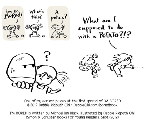
My early attempts were too rushed in pacing, and I tried to fit too much into a spread (see above).
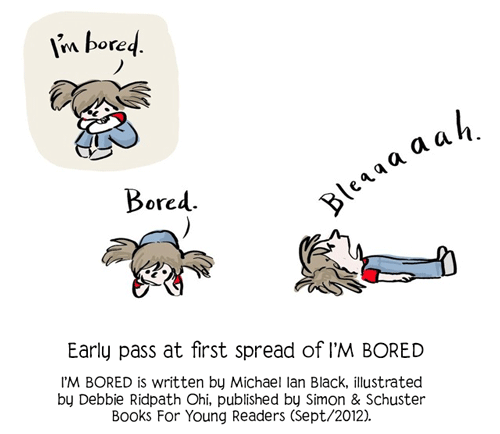
Here's my next attempt, where I simplified and slowed down pacing:
At my first meeting with Justin Chanda and Laurent Linn (see my previous post), there was a lot of cutting and pasting involved as we worked on further improving pacing. Here are photos I took of the two modified spreads after my meeting at S&S:
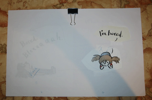
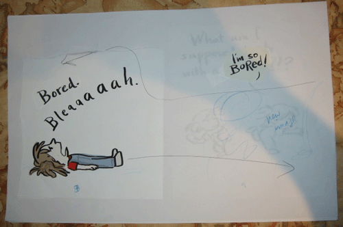
Notice how much the pacing has already improved since my sketch at the top of this post.
I experimented more with the little girl's bored poses. Meanwhile, though, I still hadn't settled on the girl's appearance (more on this in a future post), but that didn't matter as much in the beginning. The most important goal in those early stages: figure out the best visual pacing for MIB's story. The finer details could be worked out later on.
Here are how the final spreads turned out:
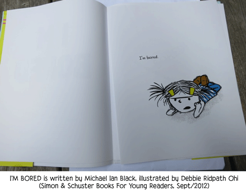
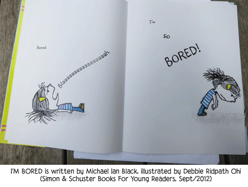
And it comes out on SEPTEMBER 4th!!! I CAN'T WAIT!!!!
Ahem. Apologies for that outburst.
More on the I'M BORED process soon...


Reader Comments (2)
Love it, Debbie.
This looks great! :)